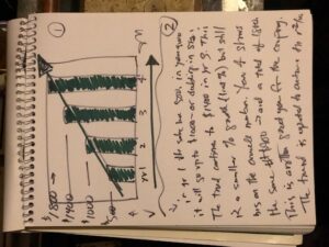
The other night I was sketching out a four year sales plan. As I was thinking about it, I decided to create a quick graph. This is at the top of the page (1). It is obvious at first glance that the trend is up. The second part (2) is a description of what the same data. I could have gone on more but ran out of space.
The picture at the top conveys more information than the description. lesson? Use charts and graphs to make your point. Too much writing can dilute the message.
No doubt the detail is needed in words — but if the graph is effective, there is less need for text.
out…
